

Take a look at the example: on the left, you see an object without any texture maps applied—it looks flat and uniform. On the right, once the texture maps are in place, you can see not only the color but also the subtle bumps and surface variations that give the object a tangible presence. This is the power of texture mapping in bringing digital fashion assets to life.
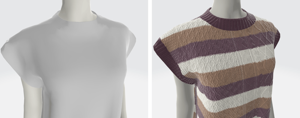
Let’s take a closer look at different types of texture maps and how each contributes to the overall material expression.
A Closer Look at Different Types of Texture Maps
Base Color Map
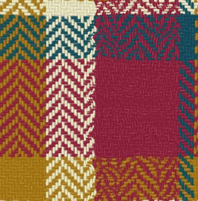
Also known as a Diffuse or Albedo map, this type defines the basic color information of a material. The example here shows the base color map of a woven fabric-like texture that captures the fabric’s appearance.
Normal Map
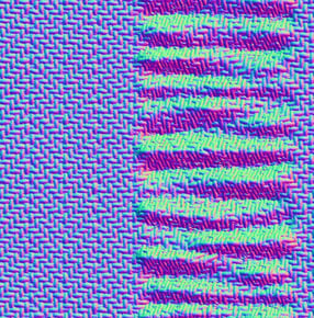
A Normal Map is used to simulate the small surface bumps and textures of a material.
It’s built from RGB (Red, Green, Blue) values, where each color channel represents a direction (X, Y, and Z) of the surface. By varying the intensity of these colors, the map gives the illusion of depth and three-dimensional detail.
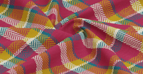
When a normal map is applied together with a base color map to a 3D object, as shown below, you can see how it adds realistic fabric texture and shading.
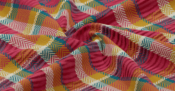
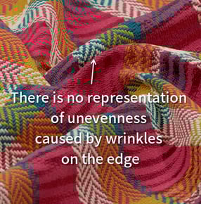
However, the effect is limited to the surface—it doesn’t actually change the geometry. The object’s edges remain flat. To create genuine surface displacement, including raised or indented edges, a different type of map called a Displacement Map is used.
Displacement Map
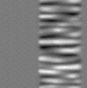
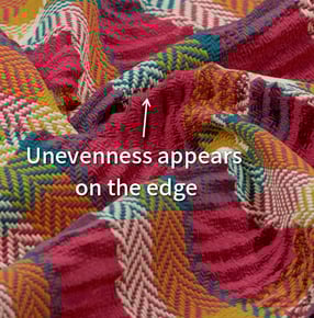
A Displacement Map is used to add real three-dimensional relief to a flat 3D surface. It uses a grayscale gradient, where white represents raised areas and black represents recessed ones. Compared to a normal map, it provides a much more realistic sense of three-dimensionality. As you can see from the example, applying a displacement map gives the object visible height variations—even along the edges.
Alpha Map
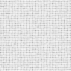
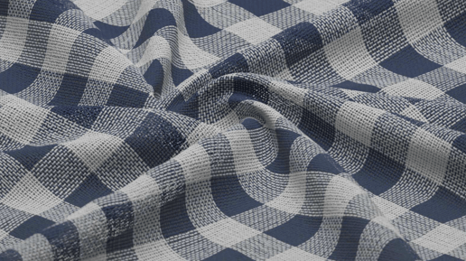
Also known as an Opacity Map, this texture defines which parts of a surface are transparent and which are visible. It’s typically a black-and-white image: the white areas remain visible, while the black areas become fully transparent. For sheer or lace-like fabrics, applying an Alpha Map helps you achieve that delicate see-through quality in 3D.
Roughness Map
A Roughness Map defines how rough or smooth a material’s surface appears.
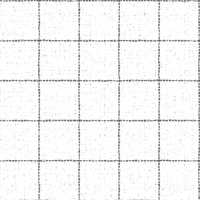
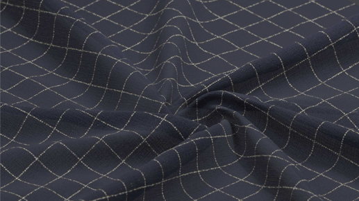
In this map, white areas represent rough, matte surfaces, while black areas indicate smooth, glossy ones. For example, in a woven fabric that uses metallic (lamé) yarns like the one shown below, the areas without metallic threads appear white—indicating a rough texture—while the sections with metallic yarns appear black, representing shiny, reflective surfaces.
Metalness Map
A Metalness Map—sometimes also referred to as Reflectance or Gloss—defines how reflective a surface should appear. In the context of apparel materials, metalness maps are often used to represent metallic finishes—such as foil prints, coated fabrics, or sparkly effects created with metallic (lamé) yarns.
The above content is reproduced from “wearware ”
wearware | Supporting the Digitalization of Fashion Design (shimaseiki.com)
0 comments